Fancy a quick chat about Flex?
Pop your details in below and we’ll give you a bell. No hard sell - just a friendly conversation to see if Ayup Flex is a good fit for your business.
Looking for flexible, no-contract support? Explore Ayup Flex – predictable monthly access to our expert services. Learn more →
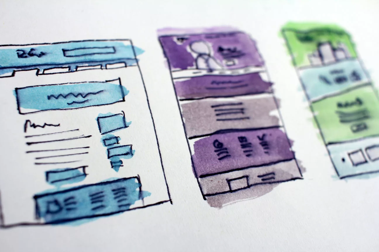
Step into the world of modern web design, where simplicity takes centre stage. Exploring the art of minimalist design, where every element serves a purpose. Dive into the fusion of clean aesthetics and seamless user navigation that not only pleases the eye but also enhances the user experience. Discover how minimalist design elevates brand identity, streamlines user pathways, and impacts your website's SEO. Uncover the connection between mobile-friendliness, responsive design, and multimedia elements to create a harmonious user journey. Experience the transformation that less can truly be more in the realm of web design.
In a world where mobile devices dominate online interactions, having a website that seamlessly adapts to various screen sizes is no longer a luxury – it’s a strategic necessity. The fusion of mobile-friendliness and responsive design isn’t just about accommodating different devices; it plays a pivotal role in your SEO strategy, impacting search rankings and user engagement.
Visual Delight: Minimalistic design prioritises visual elements that truly matter. By decluttering unnecessary graphics and distractions, your website delivers a visually pleasing experience. Incorporate relevant images or graphics in strategic places to highlight key messages or features.
Elevated Brand Identity: A simple, consistent colour palette and typography contribute to a cohesive brand identity. Every aspect of your design speaks volumes about your brand’s personality. Use multimedia components like branded images and icons to reinforce your identity within a minimalistic framework.
Focused User Pathways: Minimalistic design guides users through a focused journey, ensuring that they encounter essential content without getting lost in clutter. Use engaging visuals, such as clickable buttons or interactive images, to lead users to key sections of your website.
Streamlined Menu Structures: Simplify your navigation menu to the essentials, enhancing user understanding and reducing decision fatigue. Utilise responsive navigation elements that remain user-friendly across devices, ensuring seamless interaction and exploration.
Google’s Mobile-First Indexing: Embrace responsive design to ensure your site is prepared for Google’s mobile-first indexing approach. By prioritising your mobile content for indexing, you’ll enhance your chances of appearing prominently in search results. This adaptation includes designing media elements like images, videos, and infographics to be responsive.
Elevate User Experience: Responsive design significantly improves user experience across devices. This experience extends to various multimedia components such as images, GIFs, and embedded videos. This ensures that users can enjoy an uninterrupted flow of information, regardless of their preferred device.
Speed Matters: Responsive design often leads to faster loading times. This aspect is crucial when integrating multimedia elements such as interactive graphics, animations, and audio. Ensuring these components load swiftly can prevent user frustration and positively impact your site’s bounce rate.
Visual Storytelling: Utilise compelling image galleries to narrate your brand’s journey. Showcase your projects, office culture, or behind-the-scenes glimpses through responsive image sliders. These galleries seamlessly adapt to screen sizes, enhancing both your storytelling and SEO performance.
Engaging Videos: Incorporate product demos, explainer videos, or customer testimonials using responsive video players. By ensuring these videos adjust to any screen, you capture and retain user attention, thereby reducing bounce rates.
Interactive Infographics: Create engaging infographics that visually communicate complex information. Embed responsive infographics into your content to enhance user engagement, understanding, and shareability across devices.
Mobile-friendliness and responsive design are no longer optional features; they are essential elements of a successful SEO strategy. By optimising your website for mobile devices and ensuring multimedia elements are seamlessly responsive, you improve user experience, page load times, and overall engagement. This holistic approach aligns perfectly with Google’s indexing methodology, ensuring your website is well-positioned in search rankings. Incorporating multimedia elements within this design framework not only enhances visual appeal but also contributes to a website that’s both user-friendly and search engine-friendly.
Reach out and let’s bring your vision to life with our expert web design and development services. Say hello and start the journey towards creating a stunning, high-performing website that elevates your brand.