Fancy a quick chat about Flex?
Pop your details in below and we’ll give you a bell. No hard sell - just a friendly conversation to see if Ayup Flex is a good fit for your business.
Fancy a quick chat about Flex?
Pop your details in below and we’ll give you a bell. No hard sell - just a friendly conversation to see if Ayup Flex is a good fit for your business.
Looking for flexible, no-contract support? Explore Ayup Flex – predictable monthly access to our expert services. Learn more →
Discover the transformative potential of responsive design in crafting websites that seamlessly adapt to various devices. Learn how responsive design enhances user experience, boosts search engine visibility, and streamlines web development. With practical tips and insights, unlock the power of responsive design to engage and captivate your audience across smartphones, tablets, and desktops.
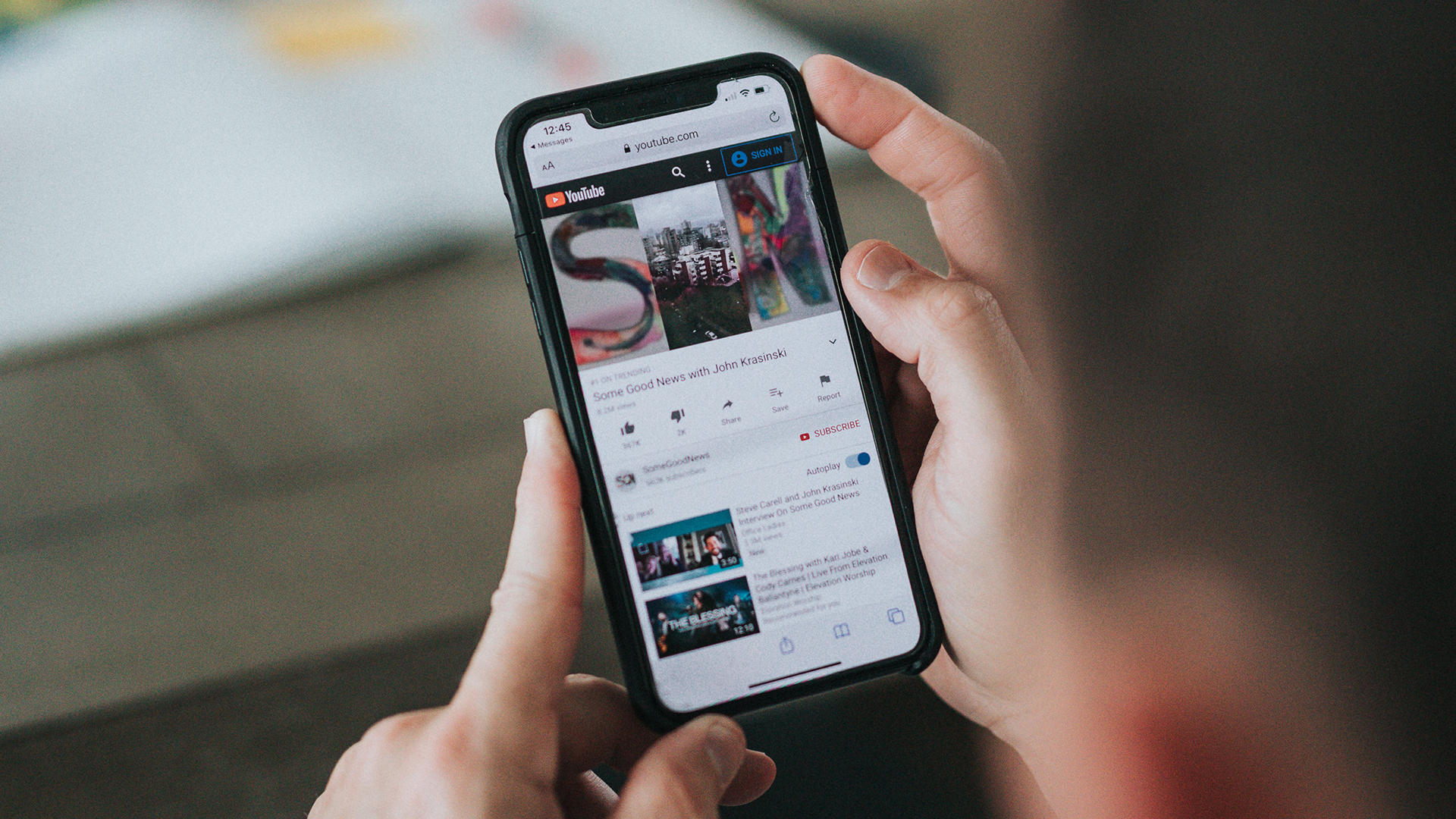
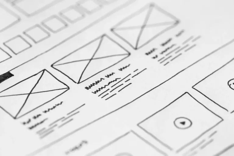
In our increasingly mobile-centric world, having a responsive website is no longer a luxury but a necessity. Responsive design allows your website to adapt and provide an optimal viewing experience across various devices, including smartphones, tablets, and desktop computers. Let’s explore the power of responsive design and its impact on your website’s success.
A key advantage of responsive design is the seamless user experience it offers. By ensuring that your website functions well on all devices, you provide a consistent and enjoyable experience for your visitors. Whether they’re browsing on a small smartphone screen or a large desktop monitor, they can easily navigate through your content, access information, and engage with your website. This enhanced user experience leads to increased engagement, longer visit durations, and higher conversion rates.
Moreover, responsive design has a positive impact on your website’s search engine optimization (SEO) performance. Search engines like Google prioritise mobile-friendly websites in their rankings, as they want to deliver the best possible results to their users. By having a responsive website, you improve your chances of ranking higher in search engine results pages (SERPs) and attracting organic traffic. This, in turn, can significantly boost your online visibility and drive more potential customers to your website.
From a practical standpoint, responsive design also brings cost and time efficiency. Rather than maintaining separate websites or versions for different devices, responsive design allows you to have one website that adapts to different screen sizes and resolutions. This simplifies your web development process, reduces maintenance efforts, and saves valuable resources. Updates and changes can be implemented more efficiently, ensuring a consistent user experience across all devices.
By embracing responsive design, you future-proof your website. As new devices and screen sizes continue to emerge, your responsive website will adapt seamlessly, reaching a wider audience and staying ahead of the curve. This flexibility and adaptability are essential in a rapidly evolving digital landscape, where user preferences and technological advancements shape the way we consume content.
In conclusion, responsive design is a powerful tool for crafting websites that cater to the diverse range of devices used by your audience. By providing a seamless user experience, improving your website’s SEO performance, and streamlining your web development process, you set your website up for success in the ever-changing digital world. Embrace responsive design and unlock the full potential of your online presence.
Stay tuned for more insights on web design and development in our upcoming blog posts.